WHAT IF no6: KENTE UPDATED!

The place for serious discussion, announcements and breaking news about Sydenham
leenewham
Posts: 5886
Joined: 2 Sep 2007 11:58
Location: SYDENHAM
Contact:

WHAT IF no6: KENTE UPDATED!

Post by leenewham »

Kente is a great little coffee shop in the high street. We are lucky that we now have a few good places to go (although I wish some were open late!).

As requested in other posts I have had a look at Kente's sign. Currently Kente looks like this:
Image

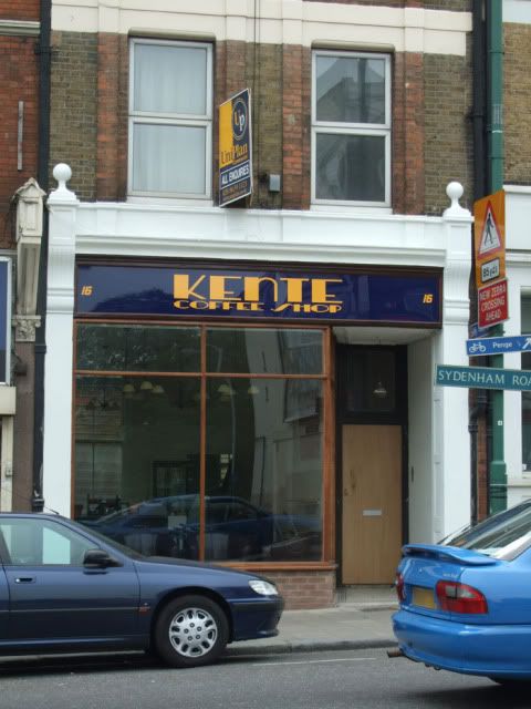
It's blue and yellow signage look more appropriate for estate agents sign that sits above the shop.

Look inside Kente and you will find old travel posters like these:
Image

The lights inside have an art deco feel to them.

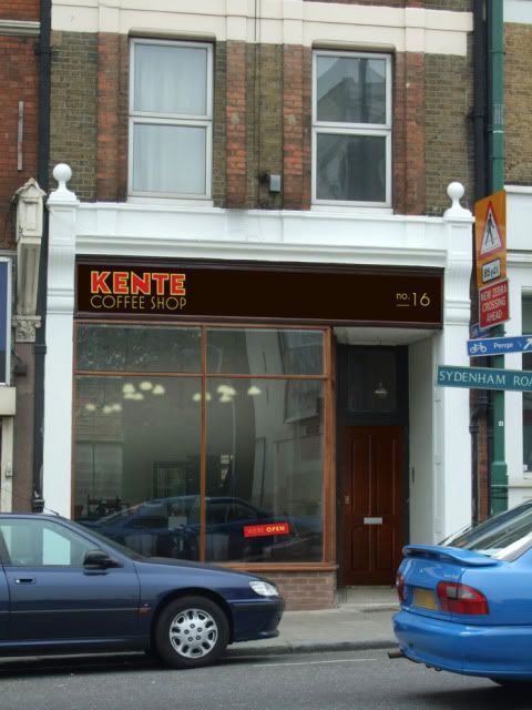
So I've picked up on some of these visual cues with the type. Colours are warm and inviting golds and reds on a roasted brown background which are colours more associated with coffee. Look at coffee packaging and a majority of it uses browns, blacks, reds and golds/yellows.

The sign would be better on wood rather than the shiny plastic background currently used.

Which could look something like this:
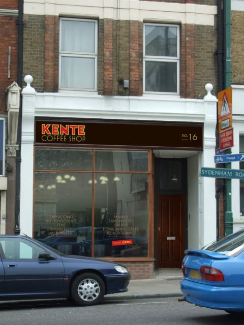
Image

Or this:

Image (new image updated, I uploaded the wrong one before) The writing is gold, not yellow.

And whatever you do with you new identity, try to follow it through to things like your menus (clipboards are excellent for menus, and you can run the menus out on your home printer.).

Image

OK, feedback time. I'm sweating a bit on this one!

More what if's can be found here:
www.whatifsydenham.wordpress.com
Last edited by leenewham on 10 Jun 2009 18:31, edited 3 times in total.
Willy
Posts: 236
Joined: 22 Feb 2007 15:07
Location: Sydenham

Post by Willy »

My 2ps worth...the sign looks great, the writing in the window however (2nd picture) makes it look tacky and cheap like the caff further up the road
parker
Posts: 564
Joined: 26 Mar 2009 21:15
Location: Sydenham Wells

Post by parker »

I really like it, looks much more contemporary and adventurous and although its quite plain, it works! It looks like it has a theme and i suppose reflects more so whatever the idea is of 'Kente'. The current one doesnt make any reference to the inside decor but this one does.

The font looks great but wonder how effective it would look on wood. I must say i prefer the first option without the writing on the window, it makes it look more intriguing and that it has more to offer inside where the writing in the window makes it look more like a cafe IMHO. I also think the one without the writing looks more up-market and the sign kind of speaks for itself. Also i would imagine that it would be nice to look outside from the inside without having the writing in the window.

Also i really like the no16 written on the sign, ive seen this on the Musti's sign and it worked for me :) the smaller lettering of this sets the sign and makes it look more definitive and complete.

Also i think it would look even better if there was some lights over the sign, whether they are on or not as they do the sign justice making it look more sophisticated.
tulip1
Posts: 44
Joined: 12 Nov 2008 20:43
Location: Sydenham

Post by tulip1 »

I think Lee is sweating over this one because the sign that's already up is perfectly fine, smart and fuss free :wink: . I also prefer that the clear glass remains clutter free. The interior of Kente is lovely, welcoming and smart. (I do however prefer wooden shop fronts and signs with shop names painted on rather than plastic signs but hey! I don't have to pay for it).

For my penny's worth, I'd say any change should be to the window frames and side door - brown frame doesn't work. Don't know which colour would go.

I like Lee's suggested menu design. :)
scott.l.hamilton
Posts: 120
Joined: 28 Jan 2008 11:51
Location: SE26

Post by scott.l.hamilton »

Like the sign and the new door to the apartments. I would prefer NOT to have the writing on the windows and think it would ruin the view from the inside. Other than that, I like the warmth and simplicity, I also really like the coffee and service inside.

I really think we should create / start a fundraiser and from the proceeds offer to contribute to or completely fund shop sign/ front makeovers for shops that we like/love and want to encourage to be better.

Anybody up for it? maybe in conjunction with the re-energised sydenham Traders Association? Stores apply for help and receive it from our talented local designers and funding assistance?

I'm game...
leenewham
Posts: 5886
Joined: 2 Sep 2007 11:58
Location: SYDENHAM
Contact:

Post by leenewham »

I've changed the window signs, I actually uploaded the wrong image!

I was sweating over this one because it was the first one that people actually asked for and therefore there were expectations over it. I'm in two minds over the type in the window which is why I put it as an option.

Sorry Tulip, I disagree with you about the current sign (this is meant in a friendly tone of voice, I know how comments can be miss-interpreted in forums and not taken how they are intended!). I don't think it's perfectly ok because it doesn't really reflect what the experience of being in Kente is like. It looks more like UNIPLAN, or FOCUS DIY and shiny plastic doesn't go with food or drink. There is definitely room for improvement. I'm not saying my design is perfect (this is good market research and can help to shape any development). And I'm not saying that Kente HAS to change their sign. The whole point of changing the sign is that it reflects their business more closely. Hopefully the feedback in here will say that I have achieved that or failed. Then the decision if is down to Kente. :-)

When I said that the sign would be on wood, I only meant that the background wouldn't be shiny, not that it's a plank of stained wood.
Gaz
Posts: 366
Joined: 17 Sep 2007 23:22
Location: Sydenham

Post by Gaz »

Hi Lee,

Ok, my tuppence worth..! :oops:

I really like the art deco look and the logo is dignified and simple - and I do like it how it is - however, perhaps it is a bit too understated?

Did you play around with having the Kente in bold type (like above) and the 'Coffee Shop' in the thin type (again as above) but next to the logo rather than underneath it? Perhaps with a simple art deco type logo (based around the 'K' in the middle?

Also, I'd love to see the upper panes in the window have some art deco motif/stained glass geometric design on them to reinforce the treasures that lie within!

Oh... and the moon on a stick, please! :D
sydenhamboy
Posts: 264
Joined: 8 Oct 2006 10:33
Location: sydenham

Post by sydenhamboy »

I think you should run with the design that you came up for the delicatessen. Could you knock up a design incorporating that font/design Lee???
Do you know the one I mean
natbeuk
Posts: 457
Joined: 26 Nov 2007 10:19
Location: Sydenham

Post by natbeuk »

Just to give my opinion.. I like it, but I think the writing is a bit small. It wouldn't catch my eye like that, I think the writing needs to take up more of the signage space.

Just my 2p's worth :)
leenewham
Posts: 5886
Joined: 2 Sep 2007 11:58
Location: SYDENHAM
Contact:

Post by leenewham »

Gaz wrote:Hi Lee,

Did you play around with having the Kente in bold type (like above) and the 'Coffee Shop' in the thin type (again as above) but next to the logo rather than underneath it? Perhaps with a simple art deco type logo (based around the 'K' in the middle?
Yep, I did. :-)

I may post it later depending on the other feedback in here. I was pondering what to put in the windows at the top. Good idea.

Part 2 coming soon!
poppy
Posts: 574
Joined: 1 Sep 2007 20:03
Location: Sydenham

Post by poppy »

Quite like the sign....

However not sure about the window. I was thinking something along the lines of that restaurant near Goose Green on East Dulwich Road would look good. I think it is called Locale, near the bike shop.

They have used a flower design in opaque white. Not sure how you do this, it might be something you stick on/peel off. Something like this around the edges I thought would look really good because the window looks so big and plain.....

Here it is: http://www.southlondonguide.co.uk/eastd ... locale.jpg
poppy
Posts: 574
Joined: 1 Sep 2007 20:03
Location: Sydenham

Post by poppy »

Also, I think the surround colour should complement the sign's colour.

The current indigo and white is a bit jarring as is the brown and white, I think anyway....I am sure Farrow and Ball or Fired Earth would have a colour that would look good :D
kente
Posts: 9
Joined: 21 May 2009 20:12
Location: sydenham

Post by kente »

We very much like the new design apart from the red colour in KENTE is there an alternative colour that could work ?and could the KENTE be bigger?. It is actually Kente Coffee House but even after two reminders the sign guy we used still kept getting it wrong!!!! Thanks for taking the time to design it
leenewham
Posts: 5886
Joined: 2 Sep 2007 11:58
Location: SYDENHAM
Contact:

Post by leenewham »

Hi Kente and everyone else who has posted on this forum.

OK I said I'd have a look at this and post some amends. So here they are in 3 stages.

In posting these I was trying to keep any changes to a minimum, so I didn't change any other parts of the frontage, but with a few subtle changes I think a greater improvement can be made.

Also I hope the colours you see on your screen match what is on mine, after seeing what the kente sign looked like on a pc at work I was horrified, It's not supposed to be bright red!

So colours are adjusted (background of sign is very dark 'roasted brown'.
Logo is gold with deep rich red-ish brown type for kente. Type is adapted from some type on old travel posters, hand drawn bespoke for this, it's not just a font!

The type works better like this and Kente is right, coffee house is much nicer than coffee shop! Luckily it just meant drawing a U, I had the other letters!

Image

Taking onboard other comments, when you step back the surround of the sign and the window don't quite match so I think it looks better if the window frame is a bit darker so they match like this:

Image

Now, as pointed out, the white shop surround looks a bit too white. So it's had the farrow and ball treatment to soften it.

Image

I'm usually against 'design by committee', but this is a good experiment and it's getting people talking about shop fronts and making it an issue.

Plus the fact that the feedback in this forum has been positive and makes sense!

So let me know what you think on this one. Is where we are in the last picture a big improvement on the first picture in this post?

Do we think it's worth Kente's time and money to do it?

And if so are we going to vote with our wallets and this Saturday morning have coffee or breakfast at Kente? See you there?
parker
Posts: 564
Joined: 26 Mar 2009 21:15
Location: Sydenham Wells

Post by parker »

This looks fantastic :wink: massive improvement, the combination of the darker red lettering of 'KENTE' and the grey/off white effect around the front really works. Regarding the rest of the frontage i think the brickwork should definetely be painted a dark brown possibly.

This would really turn heads if it goes ahead. With the darker red i can picture it better.

Wouldnt be hard to say it could be the most tasteful looking shop in Sydenham Road, very impressed indeed.
sydenhamboy
Posts: 264
Joined: 8 Oct 2006 10:33
Location: sydenham

Post by sydenhamboy »

yes best one so far Lee.
What will you do - print it off and show the boss of the shop.
Nice work that man.
SB
ALIB
Posts: 1553
Joined: 12 Oct 2006 21:34
Location: East Sussex

Post by ALIB »

I'm going to say I do prefer Lee's colour scheme, but I like the original sign too. I think it would be a tad unfair to ask the Kente Coffee shop to consider a sign re-design after only being open a couple of weeks. After all , in the big scheme of Sydenham Road, it is still probably one of the better looking shop signs.
leenewham
Posts: 5886
Joined: 2 Sep 2007 11:58
Location: SYDENHAM
Contact:

Post by leenewham »

I think the high street deserves better than ok. Shouldn't we be striving to make things better rather than just saying 'that will do'?

Tratorria didn't have to add the planters outside, or candles in its windows because in the overall scheme of things it was better than the average restaurant. But they did and it looks great!

If more shops were like this the whole high street would look better.

That's the whole point of this. To make the high street better overall. Because the overall standard of the high street is rather shabby, should be really be saying to businesses, 'you are OK as you are, don't bother making it better because there are places that look worse.'

;-)
The Clown
Posts: 401
Joined: 8 Apr 2005 14:04
Location: Sydenham

Post by The Clown »

I agree with ALIB and actualy prefer the original sign, although I do enjoy your What If? posts.

I also like the windows bare - When you are inside the shop there is a nice view right up Silverdale.

The Uniplan A board and the wonky /imposing street signs are more of a problem for me as are the bowls of fruit/mops/buckets on the pavement.

There are definately worthier causes on the high street for renovation.
Cheese Wotsits
Posts: 35
Joined: 6 Jun 2008 17:35
Location: sydenham

Post by Cheese Wotsits »

The last version is a great improvement on the actual sign. It'd definitely be worth it!!!

I know the high street has a lot of room for improvement (and to say that is a bit of an understatement), but unless businesses have the will to improve all we can do is moan about it (and that seems to be rather popular in this forum :wink: ) I got the impression that Kente wants to be more than an ok/better than nothing/average cafe in the area. If they're up for this facelift, why not support them?!
Post Reply